Overview
MTB Hero is an app that allows users to find and demo bikes near them. The app would be best leveraged by enthusiasts traveling to exotic bike destinations such as Whistler, Moab, or Sedona. Instead of Googling and calling local bike shops, users can pull up the app and find rentable hardware wherever they are. This idea would scale nicely into the sharable economy model but for now I want to keep it to bike shops so they can demo their unused fleet.
The Problem
There is no streamlined way to demo a bike. It's a pretty niche activity for users to engage in but the workflow is pretty standard. It should be simple but it's not. Instead it takes users 25+ minutes to locate a bikeshop, select a bike, schedule it, and pay for it. How long does it take us to browse and order takeout on postmates? Or even lock down a place to stay on Hotel tonight?
Surveying the landscape
I myself have tons of frustraitons demoing bikes. I travel to NorCal from SoCal often and it's a pain to Google or call bikeshops in the town I'm traveling to. Once I find a shop that demos bikes I either have to call to find out what bikes they have available, tell them when I want to demo it, and give my credit card info over the phone. IT'S 2019!
I wanted to make sure that other riders were having similar frustrations to make sure this app was worth designing. I frequent Reddit MTB and figured that would good be a decent place to start outside of my current network. I created a simple 6 question survey and actually received a good amount of data. The survey can be viewed here.
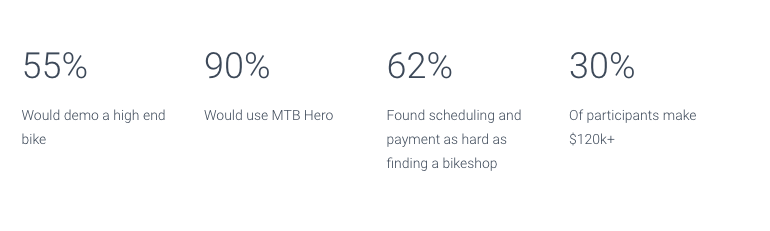
Survey results and product viability
The data collected validated my hyphothesis. Users are indeed interested in using the app and they appear to be tech savvy. This data suggests that users would be quite open to using an app such as MTB Hero but the UI would have to be seamless and as low friction as possible to ensure solid adoption rates.
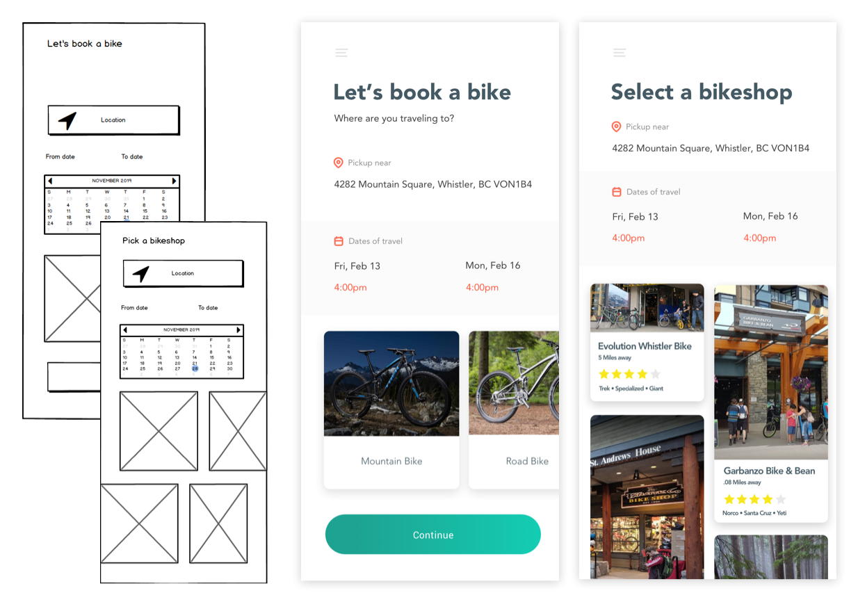
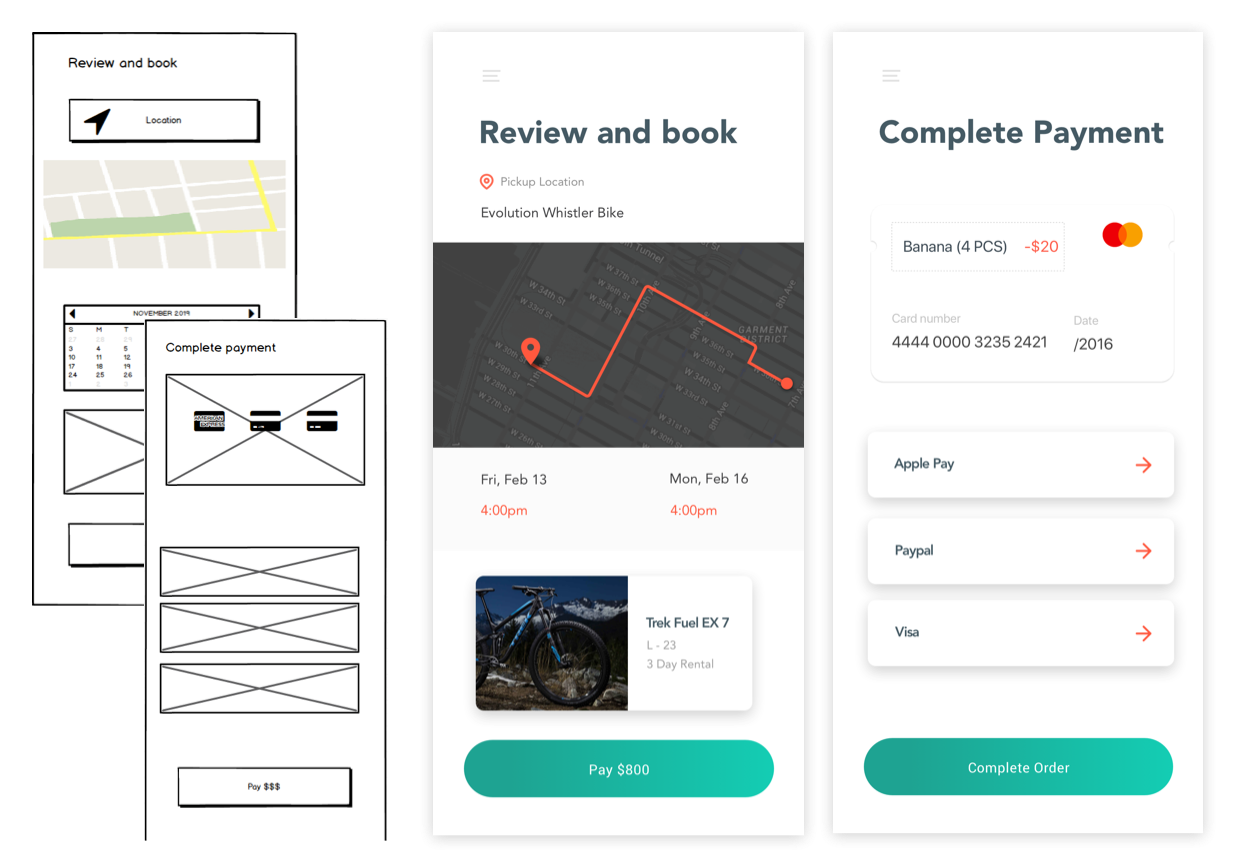
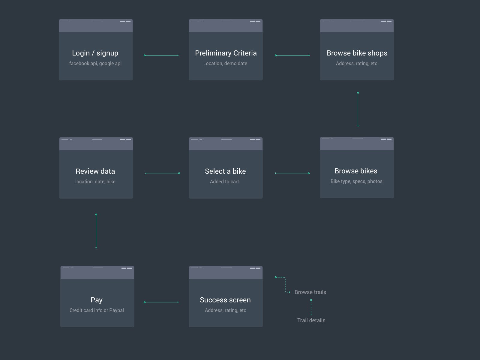
Defining the workflow
MTB Dad is a leisure biking enthusiast traveling to Whistler. He decided to book a bike for a weekend trip with his friends. He used MTB Hero to locate the best bike shop in the region, procure the bike he wanted, and decided to use paypal to reserve the bike.
I found that mtb dad’s journey could be acheived in a few easty steps:
Login & Signup
Define where to demo the bike from
Schedule a time and date to demo the bike
Browse and select a bike
Easily pay for the bike
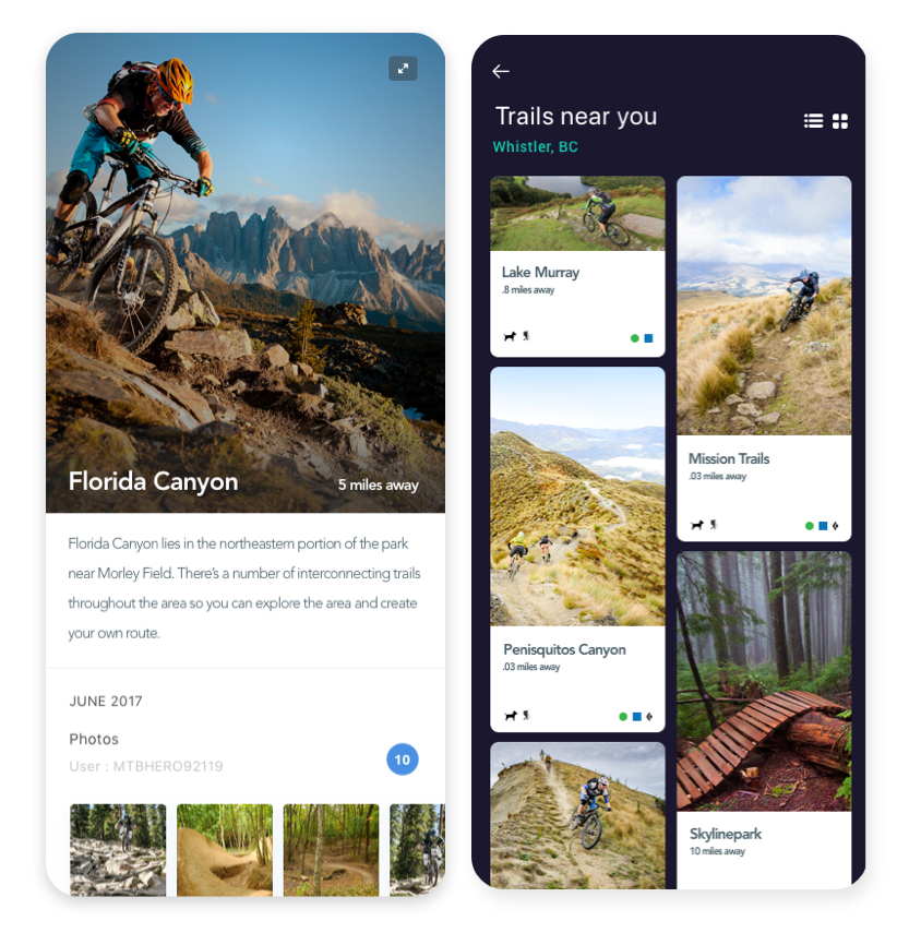
Browse popular trails near the location of pick up or in a defined area